Komo
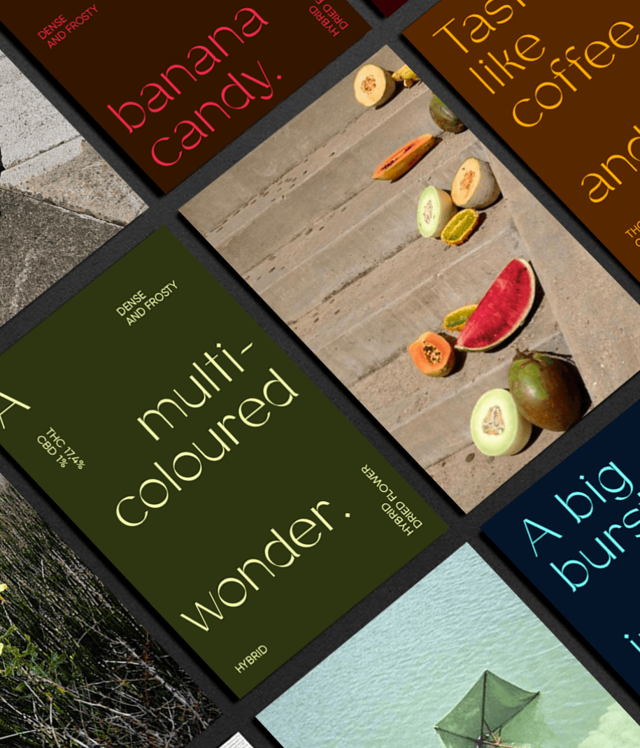
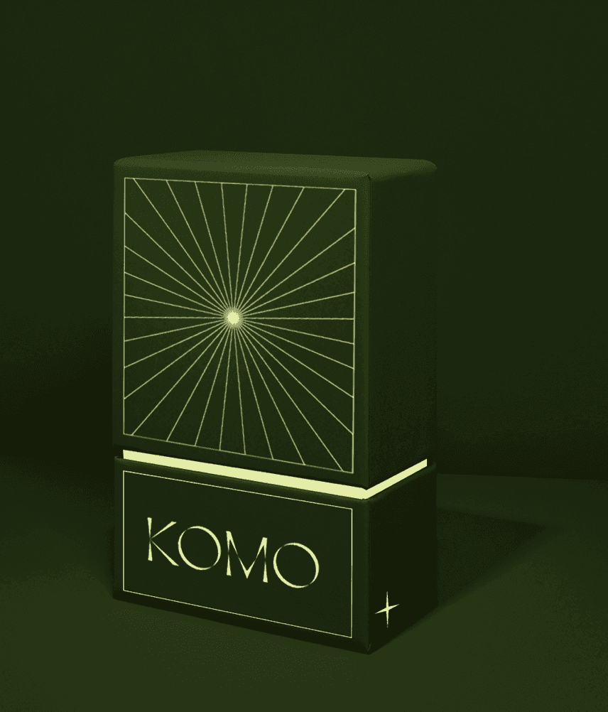
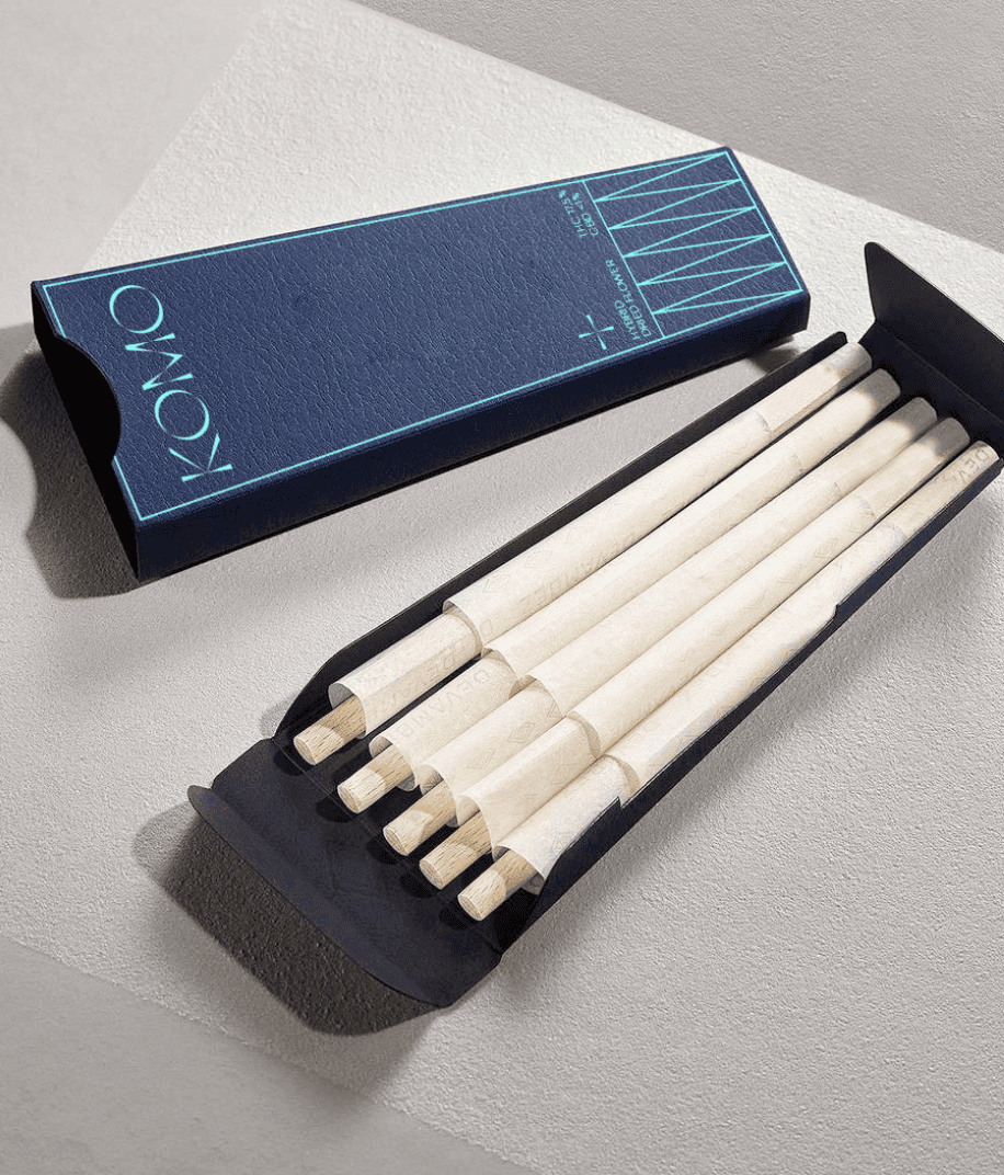
Greentone set out to launch a premium cannabis brand. We gave it a sensory twist, using the brand name, visual identity, and product descriptions as opportunities to focus on the tasting ritual and journey.
Komorebi is a Japanese concept that knows no translation, representing the interplay between light and leaves as sunshine filters into a forest. In Hawaiian, Komo is an invitation to enter.
Here, it’s a doorway to an enveloping sensorial universe.
My role: Naming & Copywriting
Agency: Sid Lee
Creative Direction: Simon Chénier-Gauvreau
Art Direction & Design: Audrey-Claude Roy