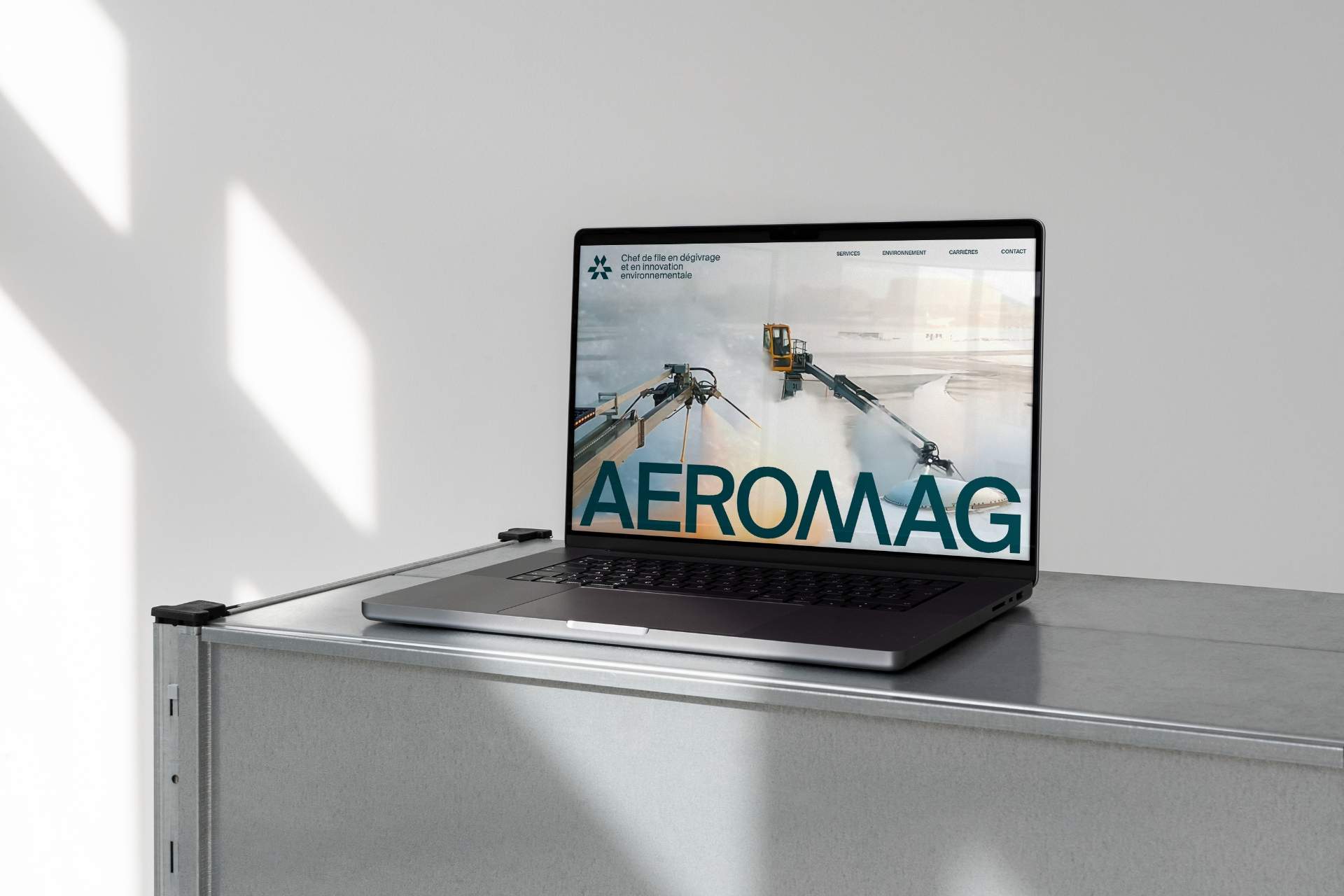
Aeromag
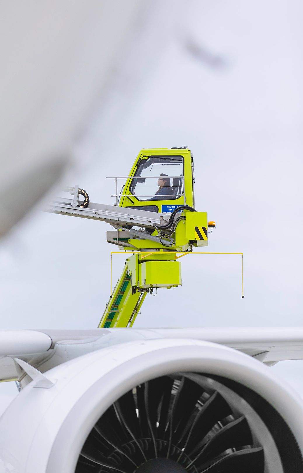
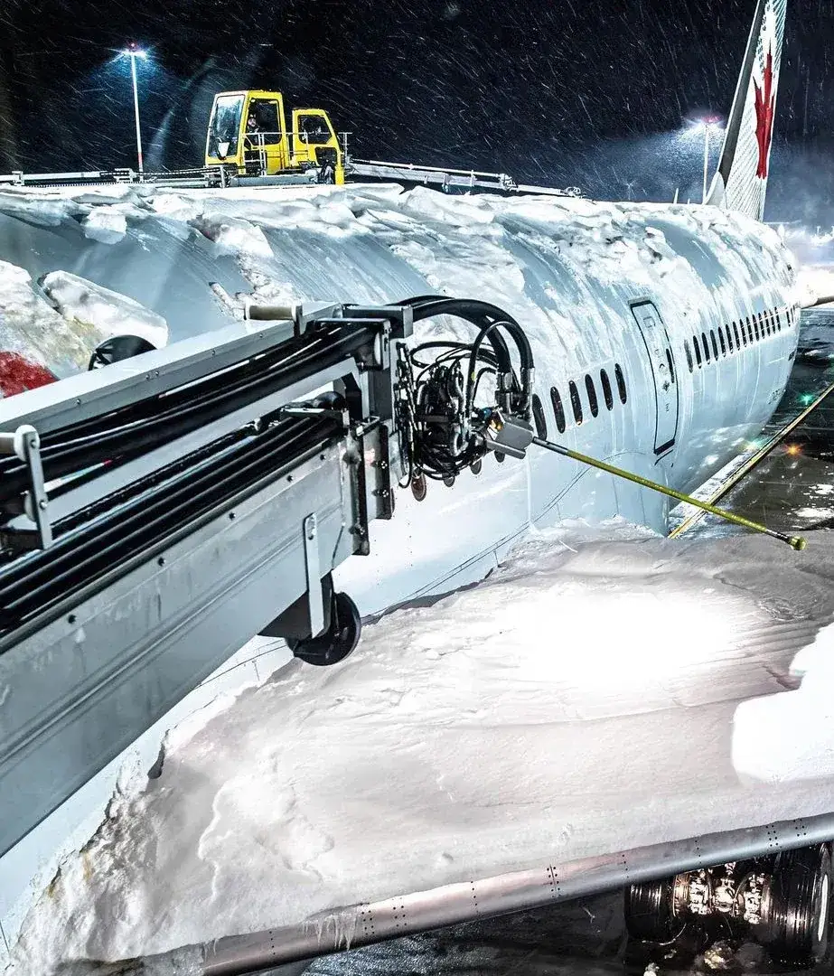
Operating over 15 stations in Canada, the US, and the UK, Aeromag specializes in aircraft deicing and environmental innovation. As the company’s identity had not evolved since the 90s, we set out to renew its positioning and design system.
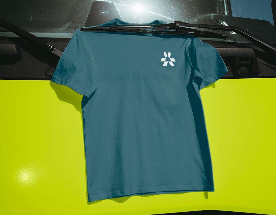
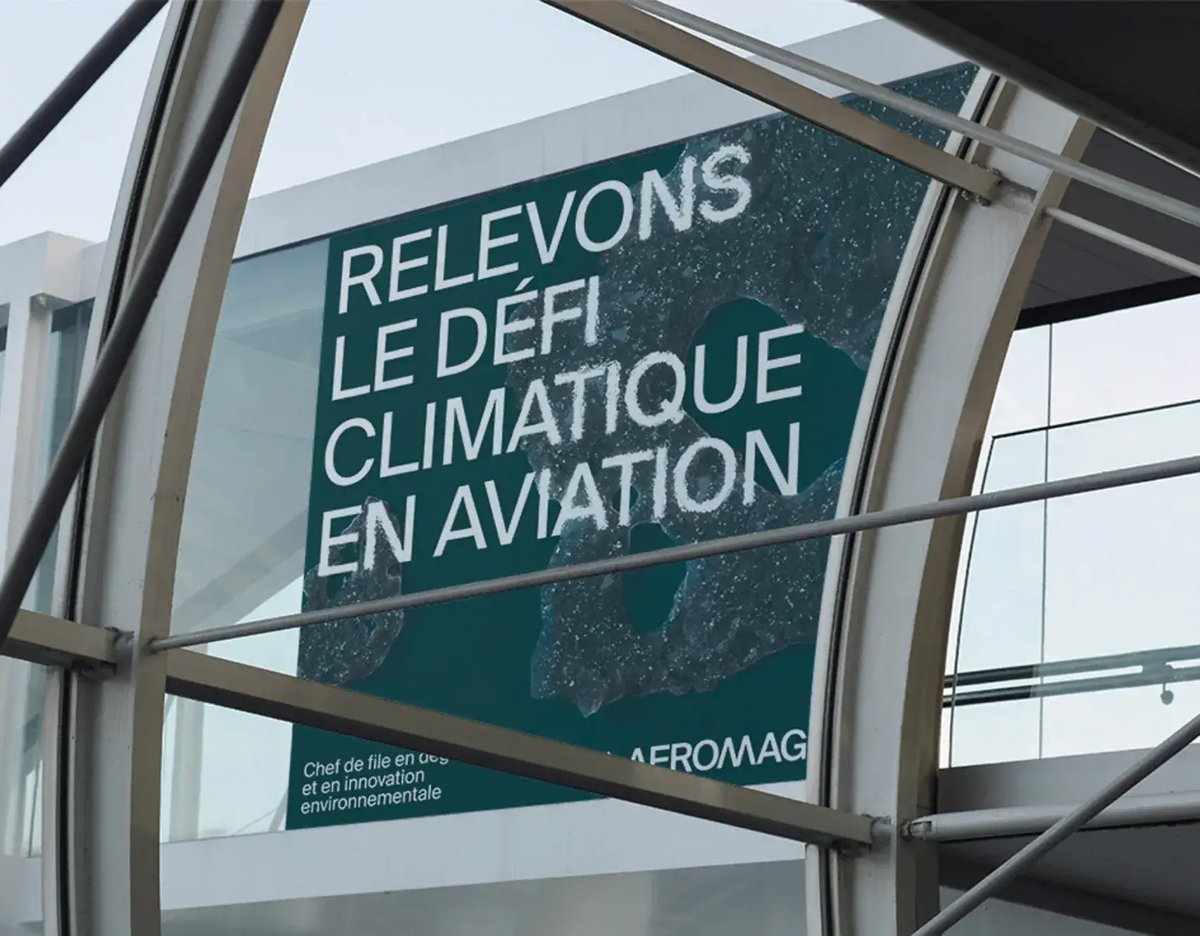
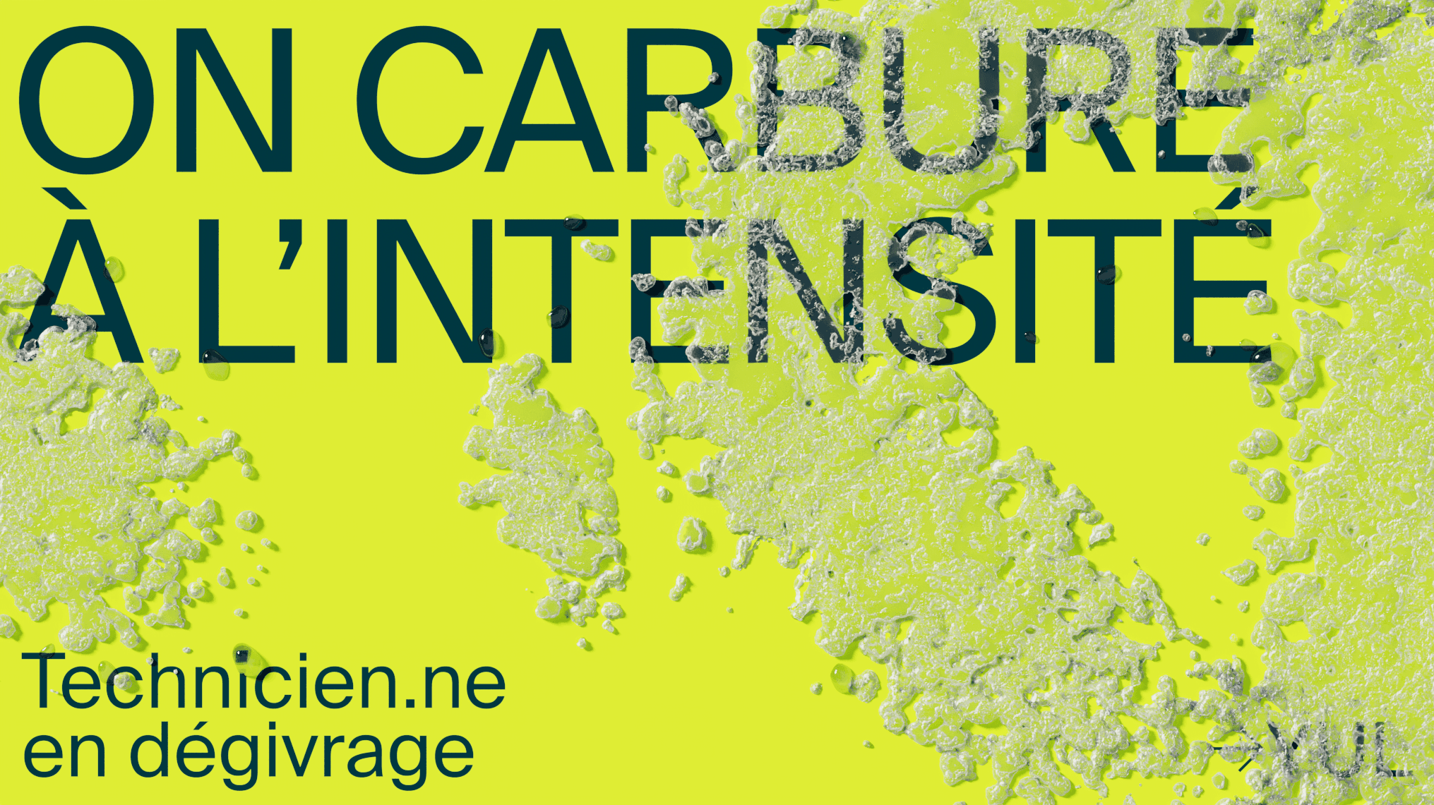
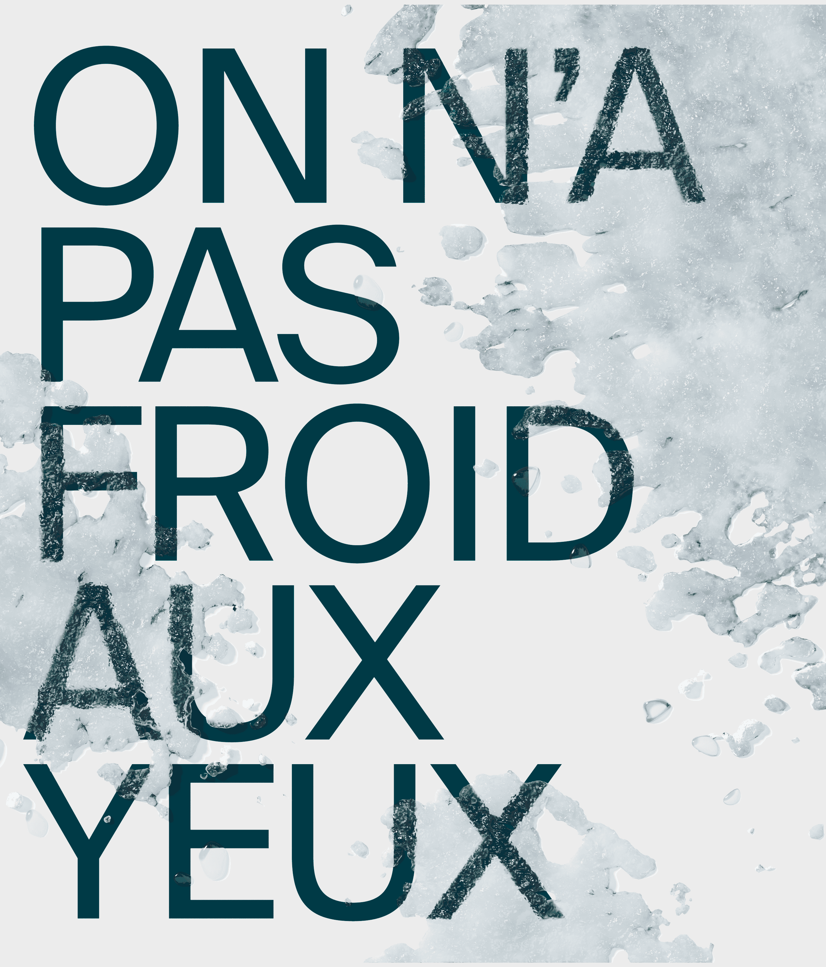
The new brand platform is inspired by the natural elements braved by Aeromag’s teams on the tarmac. The logotype features a symbol resembling a snowflake, an allusion to harsh nordic conditions. Linear typography, ever-present in transport signage, presents information in an effective, universal way, while the photographic direction communicates intensity. As for the brand voice, we opted for a unifying tone to rally all stakeholders around the ecological transition.
My role: Creative Direction
Agency: Republik
Art Direction: Melanie Boucher
Design: Pierrick Barfety
Copywriting: Elisabeth Labelle